CLIENT: TRUNK
CATEGORY: CORPORATE IDENTITY
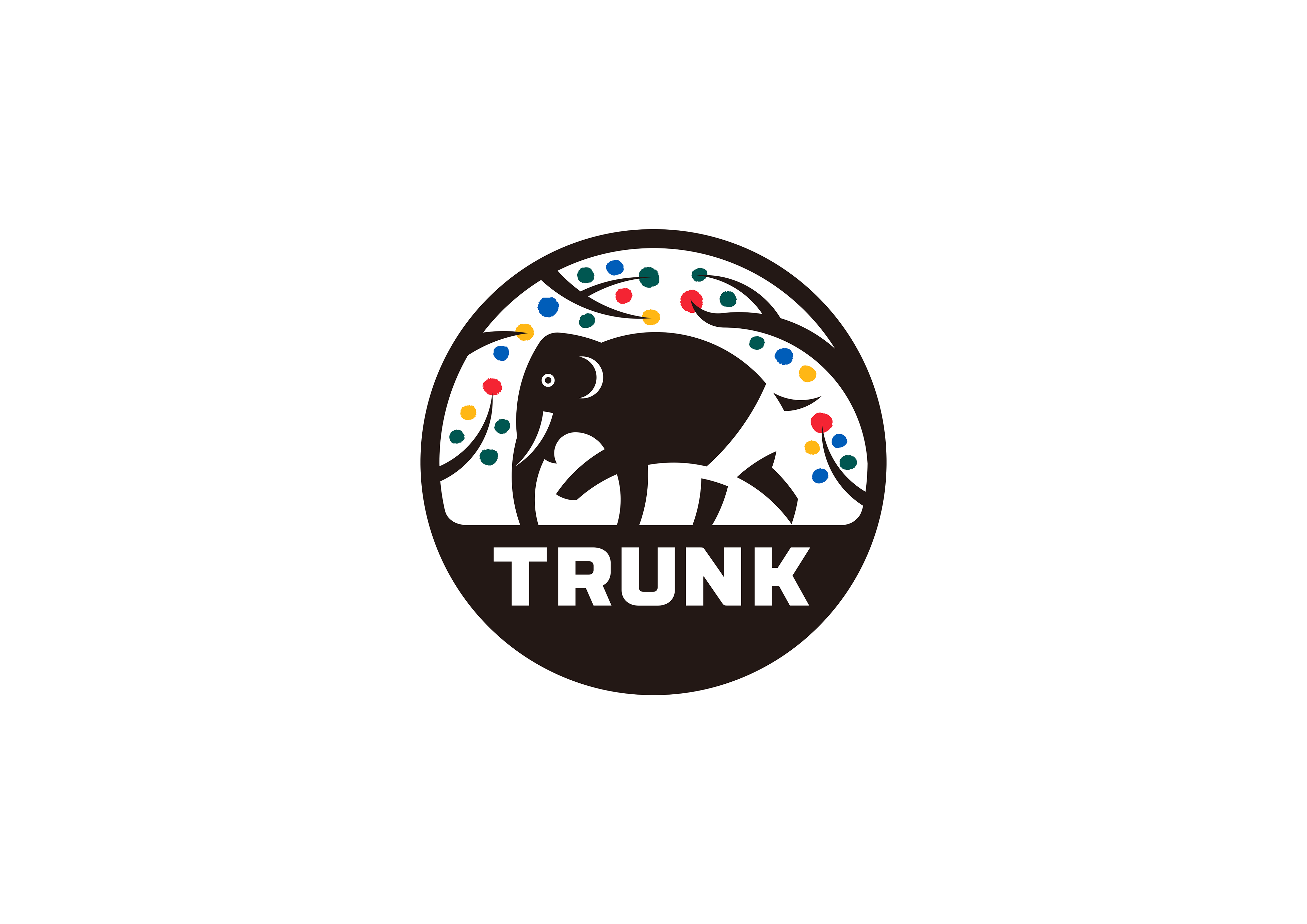
TRUNKはTake&Giveneeds会長野尻佳孝氏によって設立されたTRUNK (HOTEL)等のホテル事業を中心に展開している企業です。
Gatheringでコーポレイトアイデンティティのデザインを担当しました。
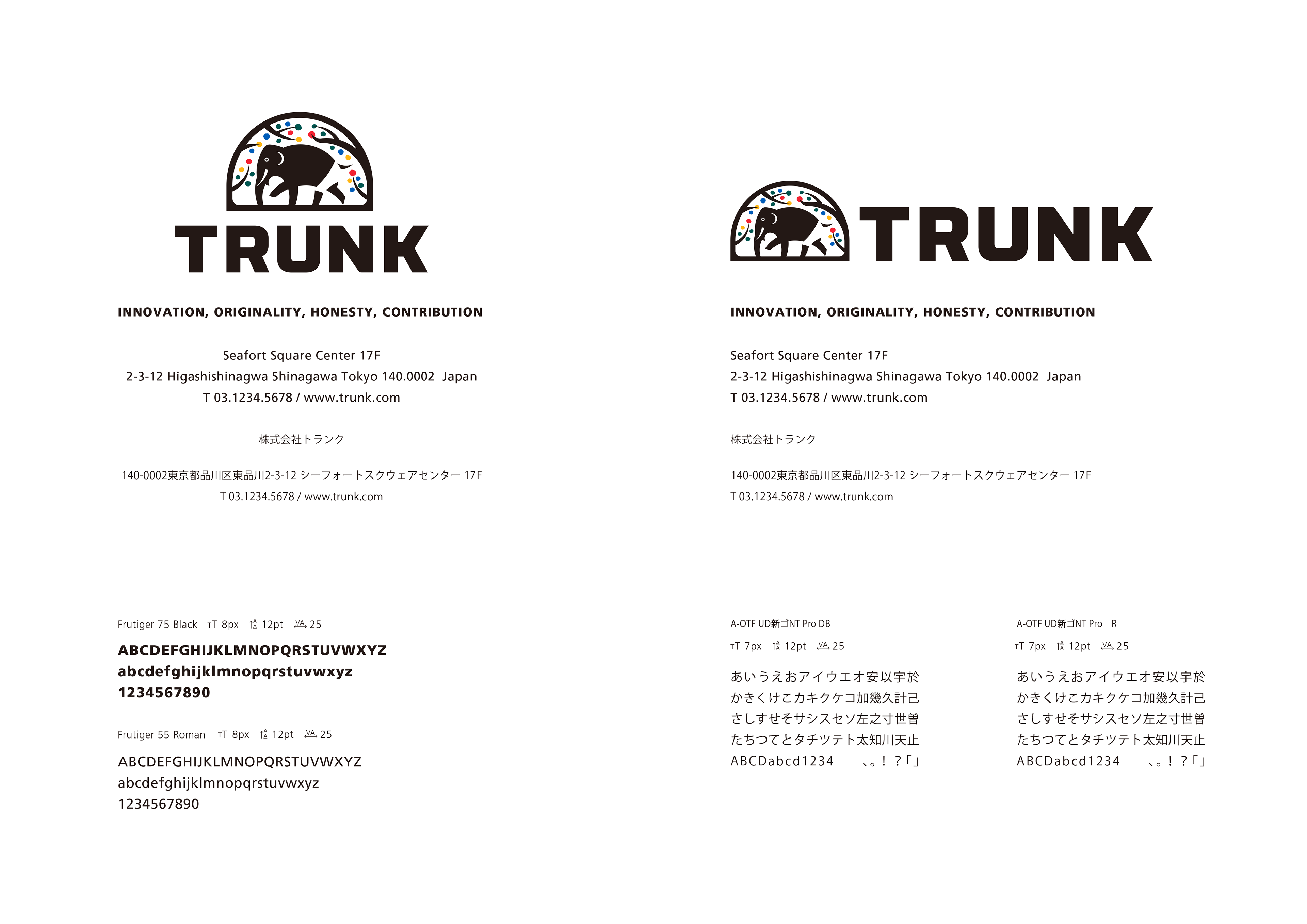
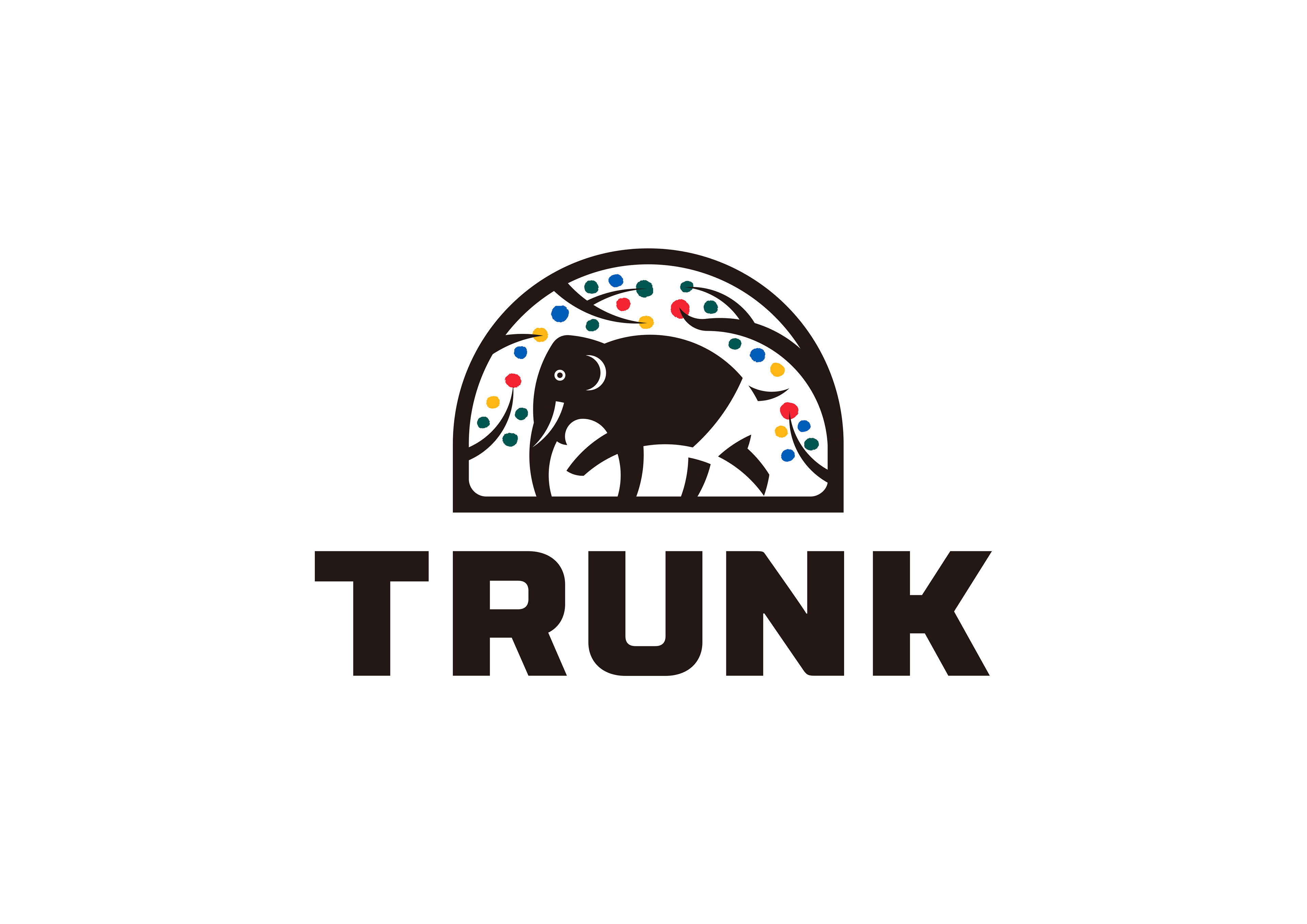
TRUNKのロゴは、TRUNKという言葉の持つ意味から引き出された「象(の鼻)」と「木の幹」、「トランクス」をメインモチーフに「革新」「独創」「誠実」「貢献」という4つのコアバリューを象徴しています。
軽やかにトランクスを履いて歩く象の姿は「革新」と「独創」を表し、それを囲むように配置された木の幹とそこに咲く色とりどりの花は「誠実」と「貢献」を表します。
一目見たら忘れない強さと、見る人を優しい気持ちにさせる柔らかさ。この2つによって、TRUNKのヴィジョンを表しています。
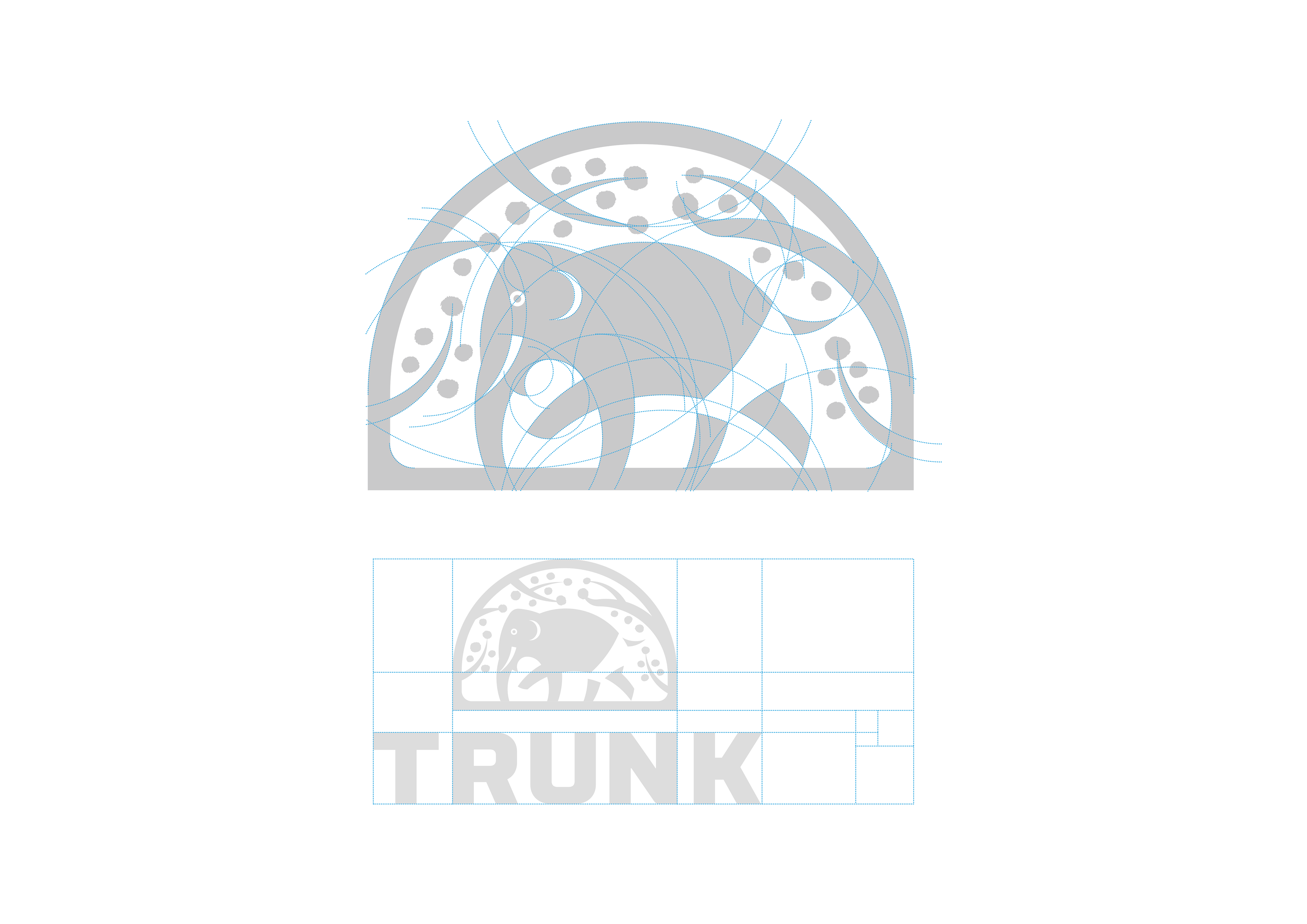
コーポレイトアイデンティテとして相応しい品格を持たせるために黄金比等を用いデザインの基幹にのっとり慎重にデザインされています。
Gathering designed corporate identity.
The TRUNK logo consists of "elephant's nose", "tree trunk" and "trunks" derived from the meaning of the term TRUNK as the main motif "innovation" "ingenious" "honest" "contribution" It symbolizes one core value.
The figure of the elephant lightly wearing a trunk shows "innovation" and "originality", the tree trunk arranged to surround it and the colorful flowers blooming therewith represent "sincere" and "contribution" .
Strength not to forget at first sight and softness to make the viewer gentle.By these two, it represents TRUNK's vision. It is carefully designed according to the backbone of the design using golden ratio etc. so as to have a suitable dignity as a corporate identity.
TRUNK Logo (Primary use)
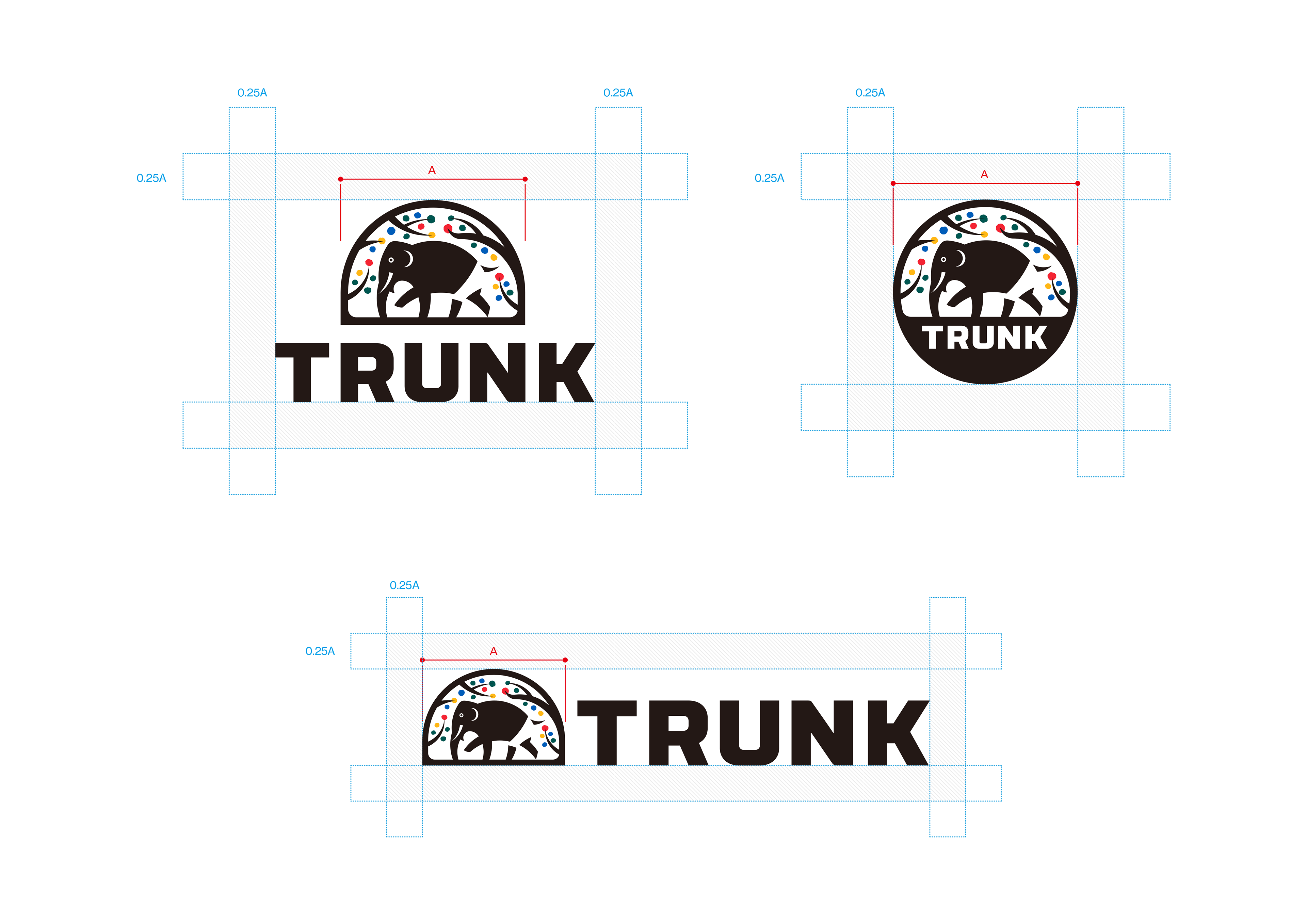
Composition
This logo is the central element in TRUNK’s visual communications system.
Through consistent and repetitive use as a signature device and design element in all of TRUNK’s visual communications, the logo becomes a visual shorthand which identifies the Agency and symbolically embodies its activities, achievements and goals.
The logo should never be altered or distorted in any way. It must not be re-drawn, but rather reproduced photographically from reproduction artwork included in this manual.
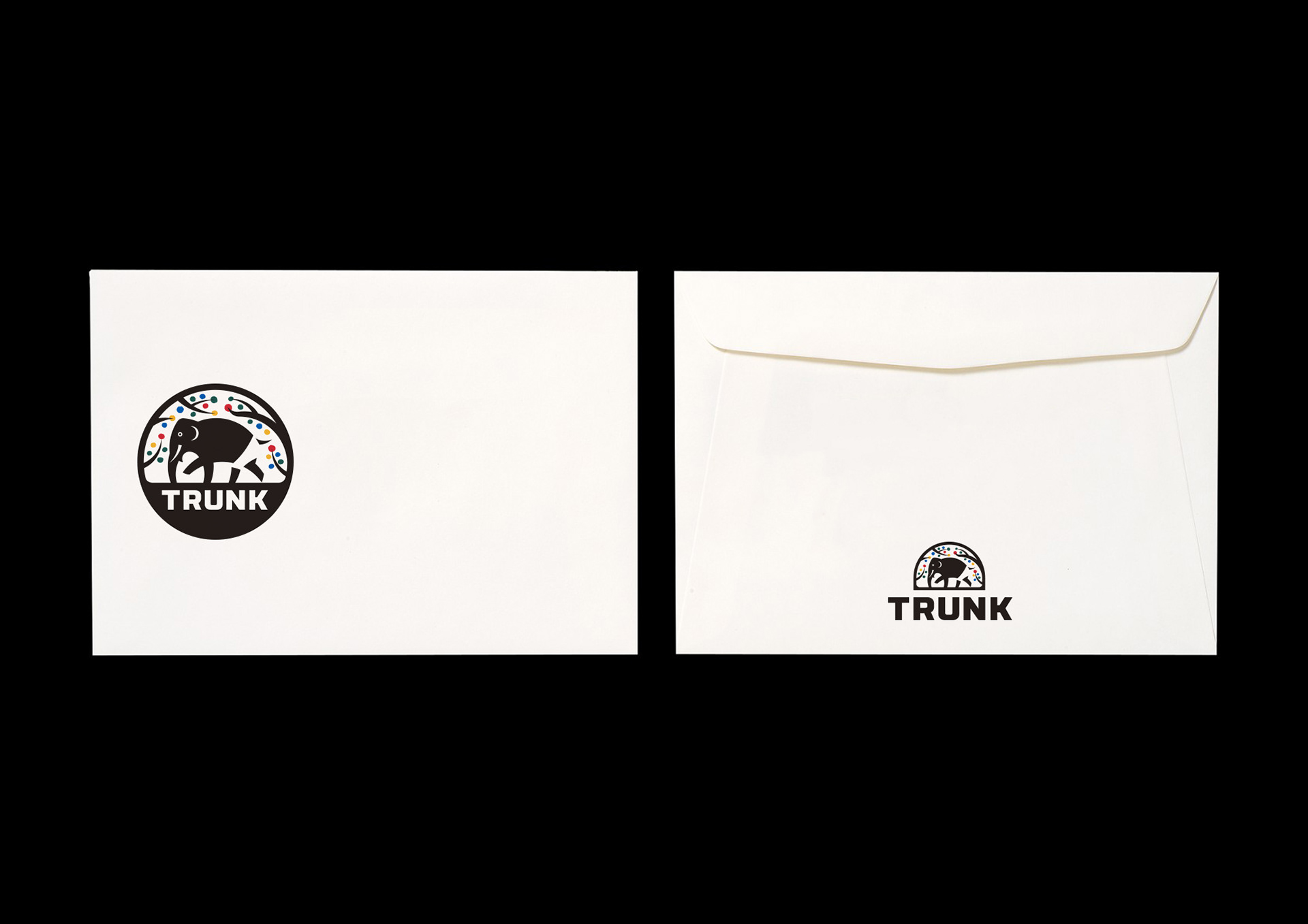
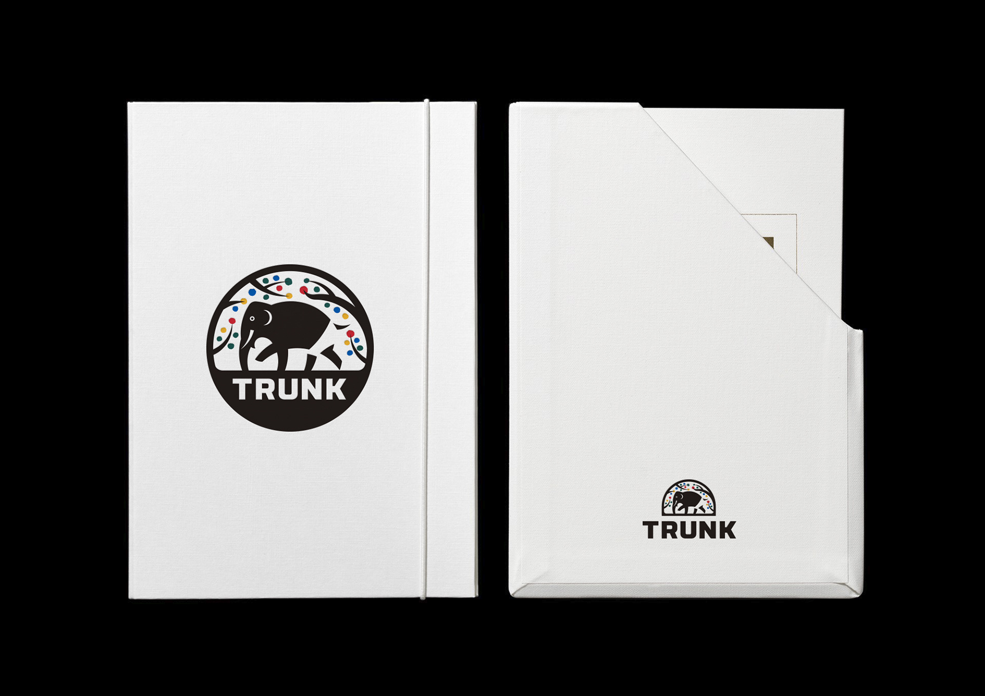
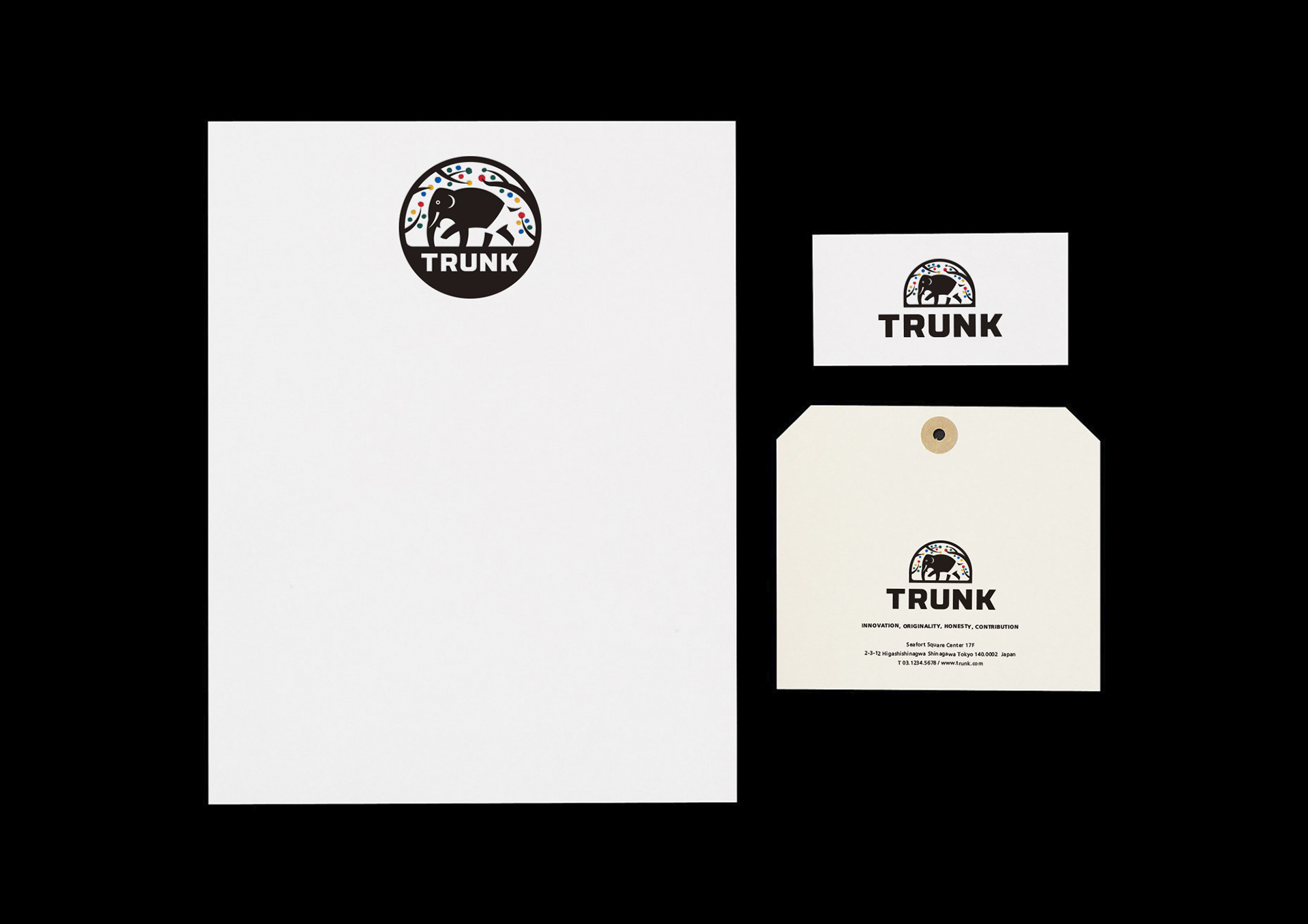
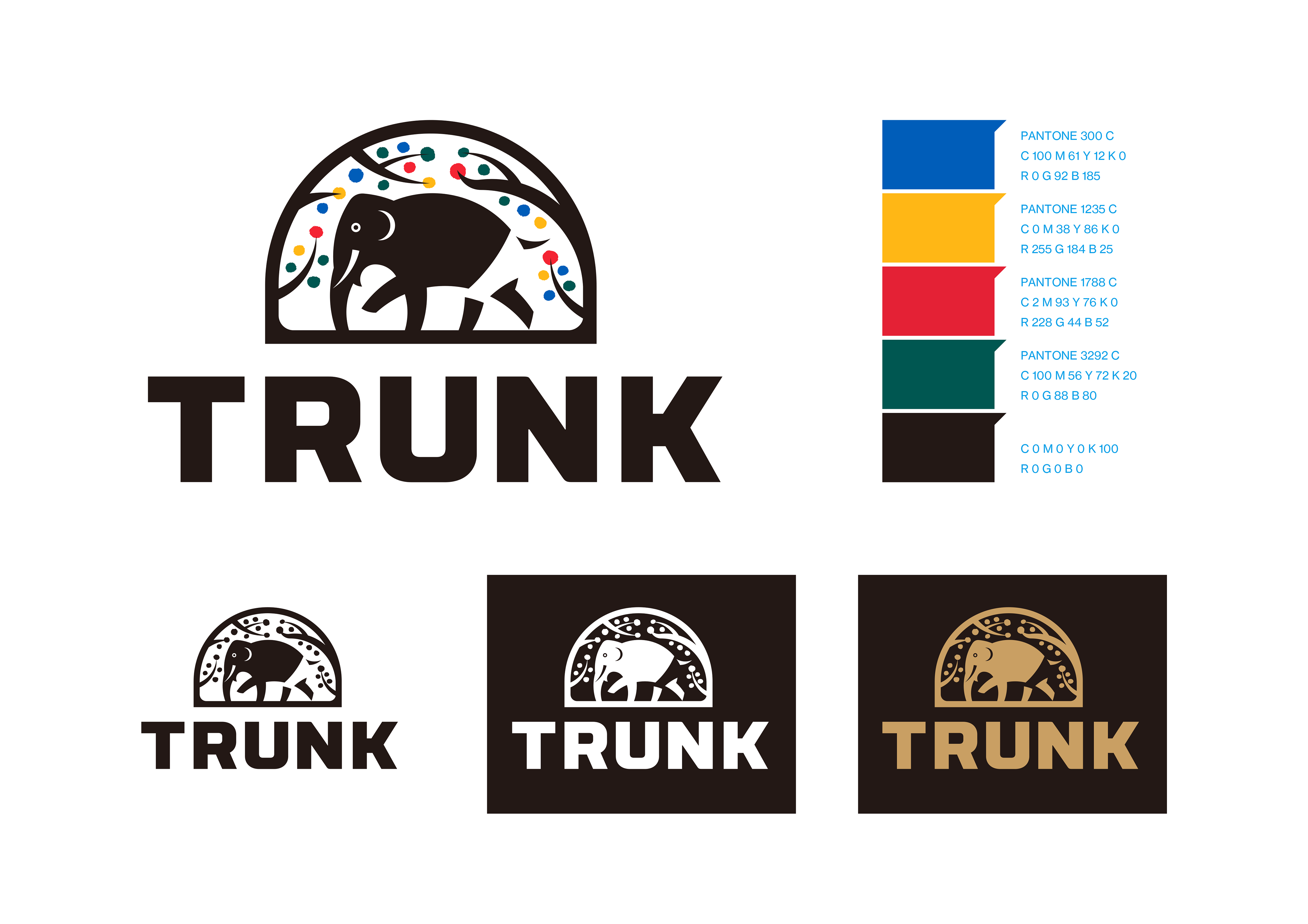
TRUNK C.I. (Primary use)
The correct color for use in the TRUNK logo is shown below.
TRUNK black should be used only when second color is available and appropriate.
It is intended to be used only on white or a light value netural color backgroud. black should not be used with other bright saturated colors, or medium and dark value colors, as they will dilute the effectiveness and impact of the black.
Further guidance for the use of the logo in various color situations is contained on the manual.The examples shown below illustrate acceptable uses of the TRUNK logo type in various situations.
White Background Against a white background the logo may be shown in TRUNK colors and black.Black or Very Dark Value Background Against a black or very dark color background , the logo should always be shown in white or gold leaf.
TRUNK C.I. (Secondary use)

Large Applications
TRUNK logo should be reproduced photografically whenever possible.However, for large applications such as signage, the logo may be reproduced using this grid drawing as an accurate guide.

TRUNK C.I.
Margin Setting & Layout
TRUNK C.I.
Typeface - Sans Serif / Frutiger
Frutiger is the most important family of type in the TRUNK Unified Visual Communications System. Frutiger is used in combination with the logotype to form the fundamental elements of identification.In addition , this typeface can be used in numerous media and in a variety of situations to create a clean and con temporary visual program . The cursive san-serif letterforms make it extremely legible, even at very small sizes.Headings which accompany Frutiger 75 Black text settings are set in Frutiger 55 Roman. Incertainsituations Frutiger may be an appropriate alternative . Headings are set in upper and lower case.