OVERVIEW
ハナエモリ・アソシエイツは「ハナエモリ(HANAE MORI)」の新デザイナーとしてパリ在住の松重健太と契約し2020年春夏物よりデザインを統括することになりました。
それに伴い、Gatheringでは新たに生まれ変わるハナエモリに相応しいブランドアイデンティティ(B.I.)をデザインしました。
新デザイナー松重健太の持ち味とハナエモリの持つレガシー双方の魅力を取り入れ、新生ハナエモリ今後のブランドビジョンを示すようデザインされた、
ロゴとシンボルマークを中心としたB.I.デザインです。
Hanae Mori Associates has signed a contract with Kenta Matsushige, a resident of Paris, as a new designer of "HANAE MORI", and will oversee the design from the spring / summer 2020.
Gathering has designed a brand identity (B.I.) suitable for the newly reborn Hanae Mori.
Designed to show the brand vision of the new Hanae Mori, incorporating both the characteristics of the new designer Kenta Matsushige and the legacy of Hanae Mori.

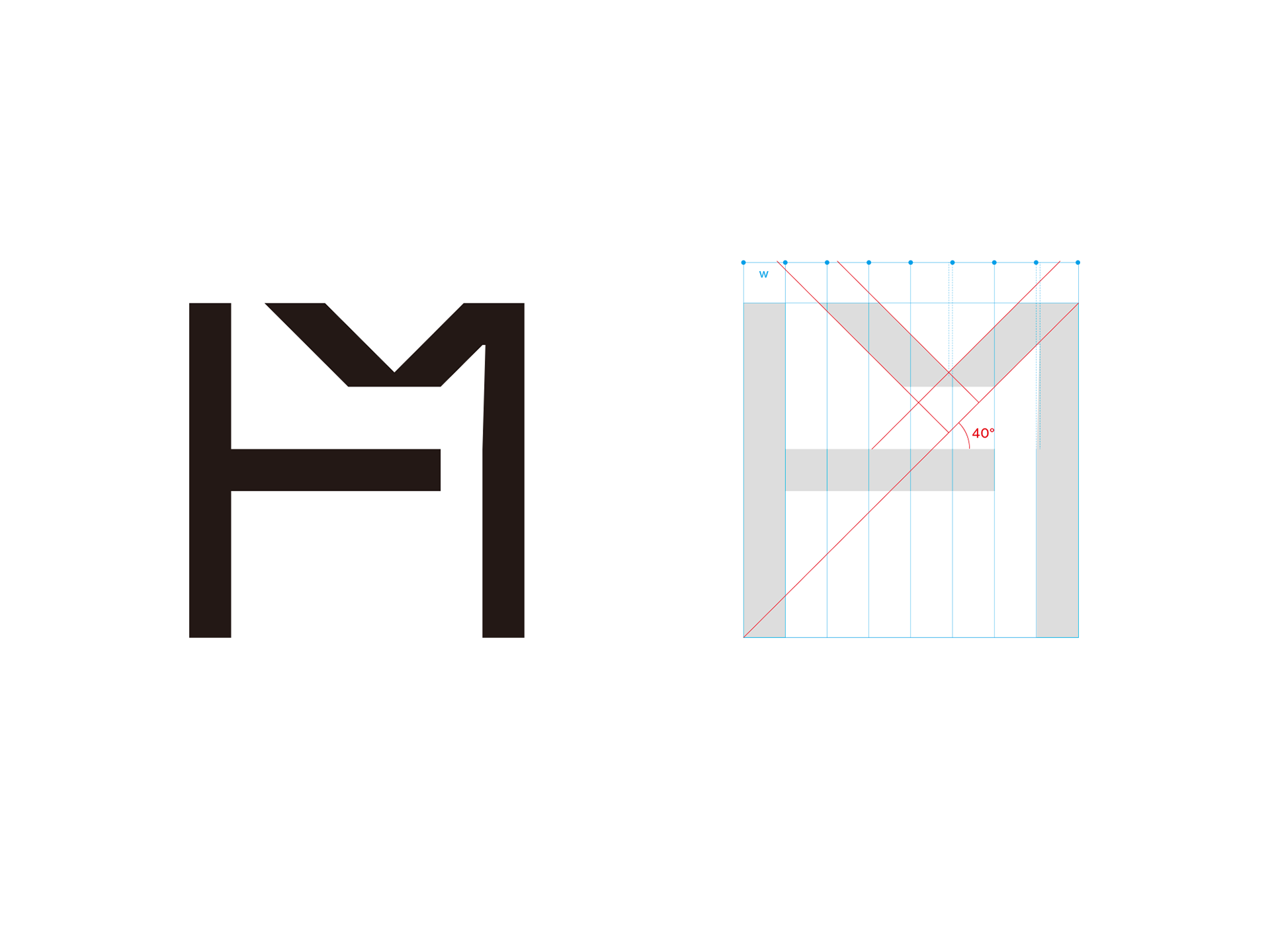
HM MONOGRAM
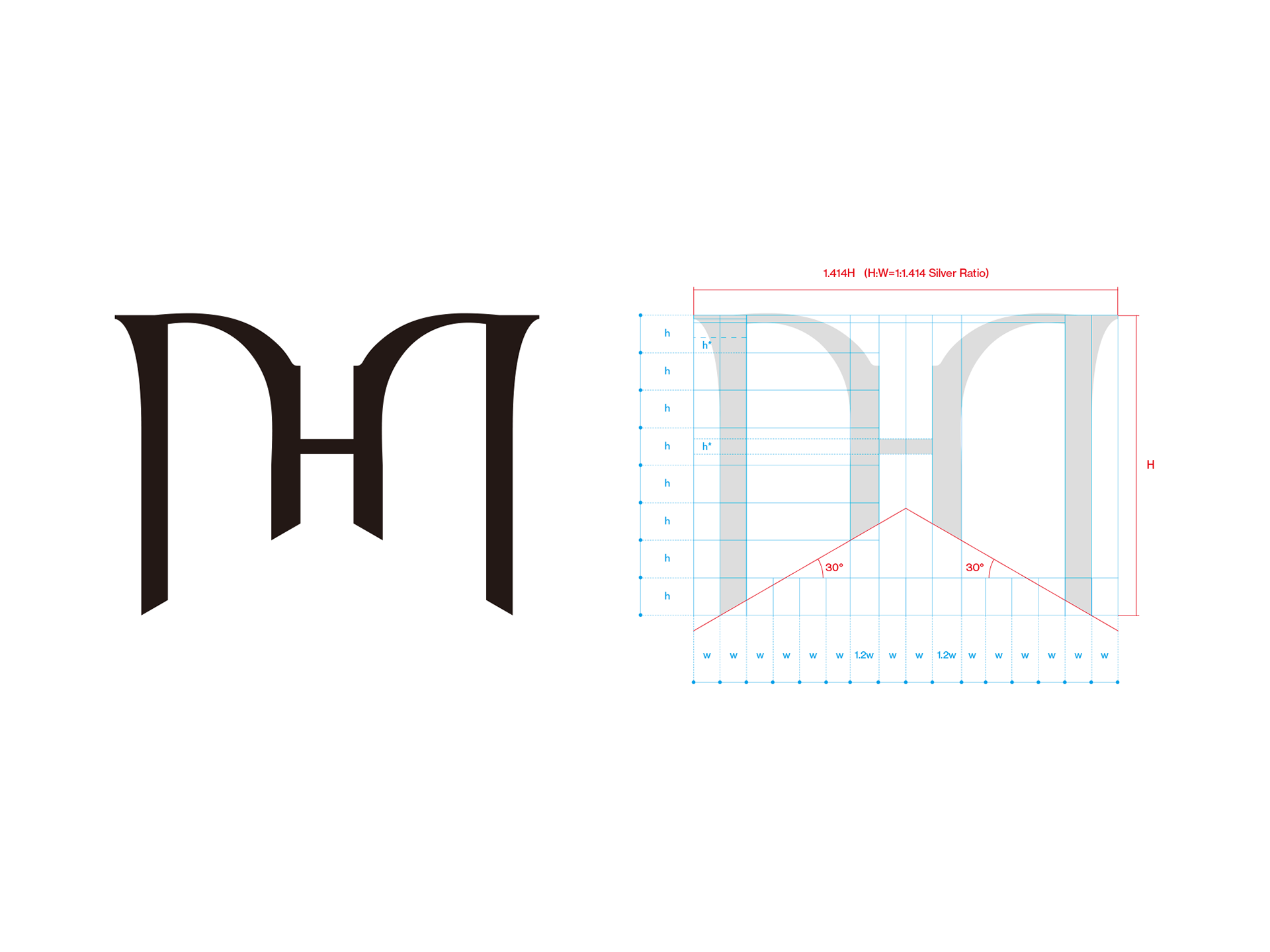
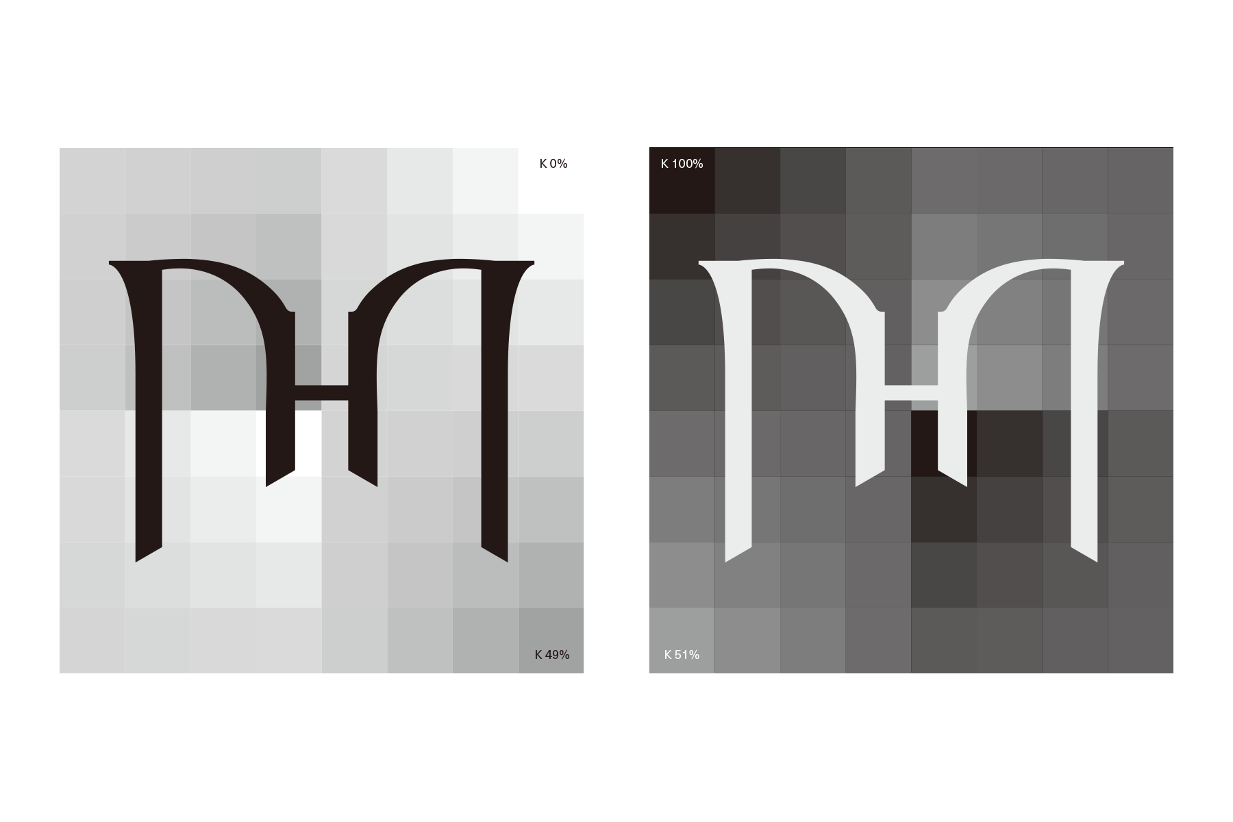
70年代に田中一光氏がHANAE MORIの為にデザインした蝶をモチーフにしたロゴをアイディアの出発点としたのは、新たなアイデンティティを創造する上でとても自然な流れでした。
蝶とHMモノグラムを組みわせたシンボルというアイディアは、新デザイナー松重君から提案されたものです。
Gatheringからもいくつかのアプローチを提案し、10種類ほどの候補の中から最終案が選ばれました。
日本の伝統美を感じられるようにという思いを込めて、シンボルの基本構成比には白銀比を用いました。
「EAST MEETS WEST」と称されたHANAE MORIを体現するシンボルとなるよう、そこへ西洋的なデザインアプローチを加えることによって”ネオクラシックでオリエンタル”な雰囲気を与えています。
It was a very natural way to create a new identity when the idea of using a butterfly-motif logo designed for HANAE MORI by Kazumitsu Tanaka in the 1970s was the starting point for the idea.
The idea of a symbol combining butterfly and HM monogram was proposed by a new designer, Matsushige.
Gathering also proposed several approaches, and the final draft was selected from about 10 candidates.
We used the silver-to-silver ratio as the basic composition ratio of the symbols, with the intention of feeling the traditional beauty of Japan.
By adding a Western design approach to the symbol that embodies HANAE MORI, called "EAST MEETS WEST," it gives a "neo-classic and oriental" atmosphere.
HANAE MORI
WORDMARK LOGO
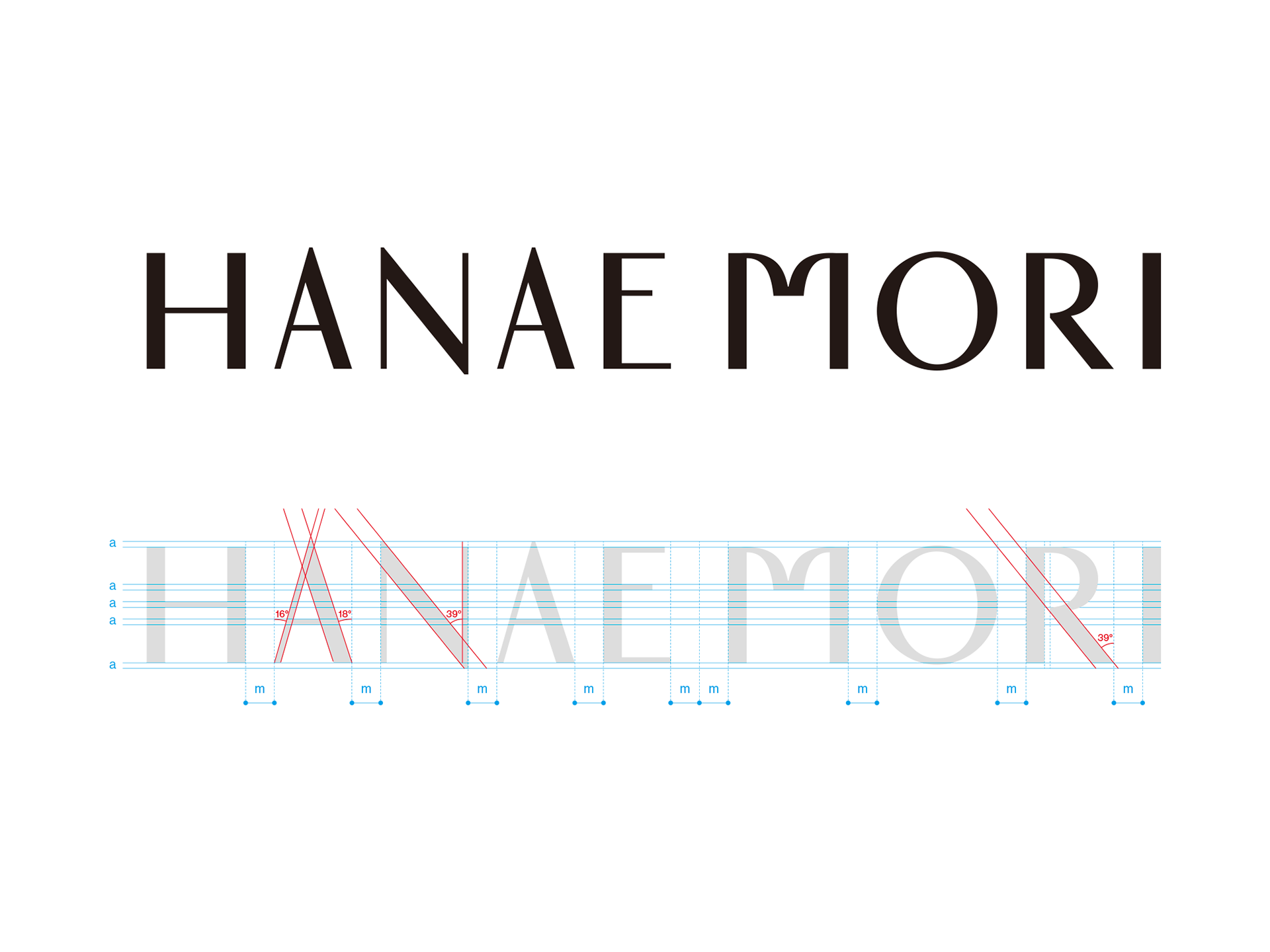
HANAE MORIブランドロゴタイプは、シンボルマークとの統一性を考慮した書体でデザインされています。
モノグラムでも使用されている蝶を連想させる"M"が特徴的なネオクラシックでオリエンタルな雰囲気を持ったデザインです。
e-bar heightとA-bar heightの差を通常より大きくとりることによって生まれるスペースと、各レター幅も通常より大きく差をつけることでリズム感を生み出し、落ち着きと躍動感を混在させています。
The HANAE MORI brand logotype is designed in a typeface that takes unity with the emblem.
It is a neo-classical and oriental atmosphere featuring "M" reminiscent of the butterfly used in the monogram.
The space created by making the difference between e-bar height and A-bar height larger than usual, and the width of each letter also made larger than usual to create a sense of rhythm, mixing calm and dynamism.
HM MONOGRAM
for Licensed Products
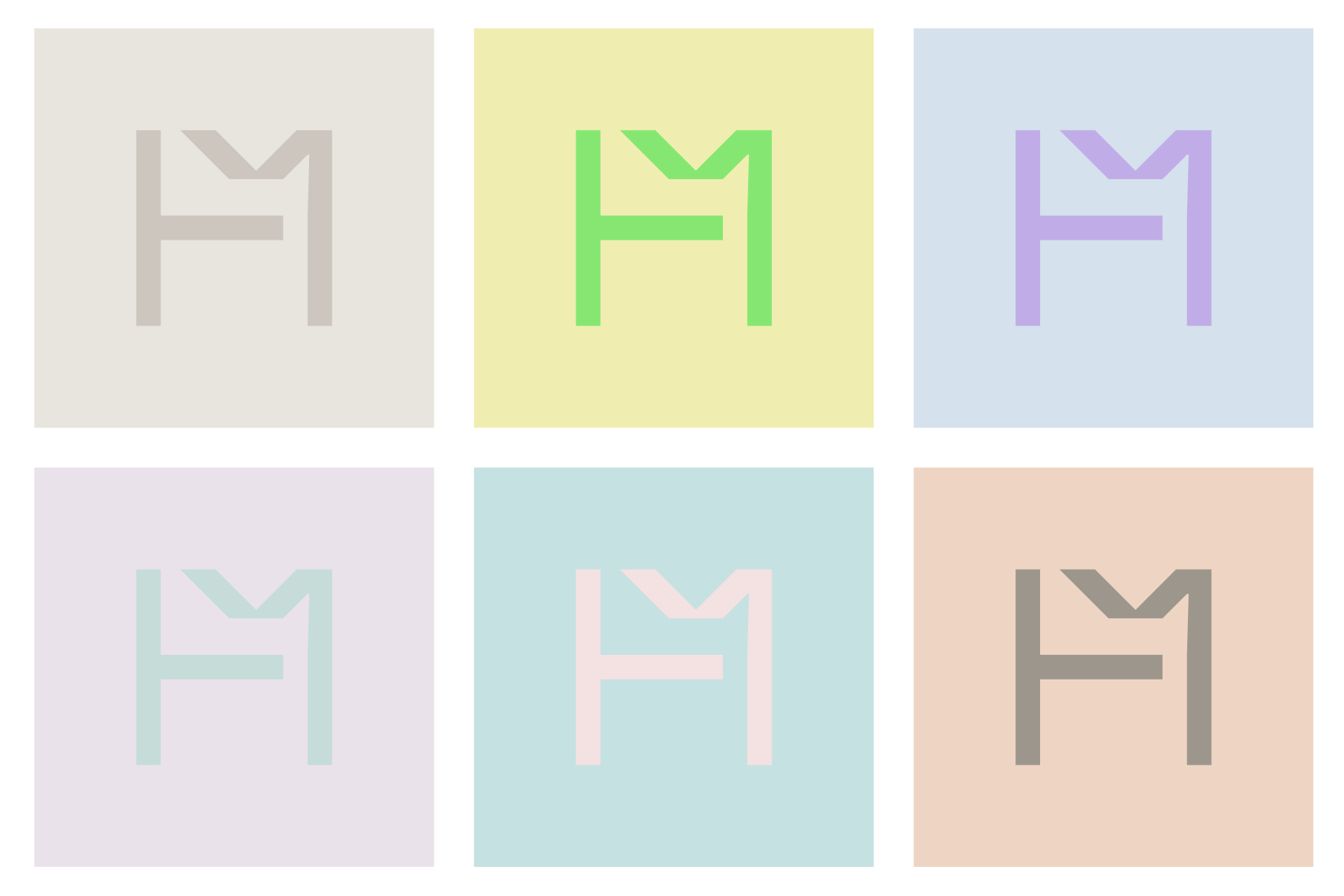
HANAE MORIブランドのコレクションラインとは別ラインで使用するモノグラムです。
HとMを組み合わせたモノグラムという部分においてはコレクションラインと同じ成り立ちでデザインされていますが、
こちらのモノグラムはより広い範囲での使用を想定している為、汎用性やフラット感を意識したデザインで仕上げられています。
This is a monogram used on a separate line from the HANAE MORI brand collection line.
The monogram that combines H and M is designed in the same way as the collection line,
Since this monogram is intended for use in a wider range, it is finished with a versatile and flat design.