OVERVIEW
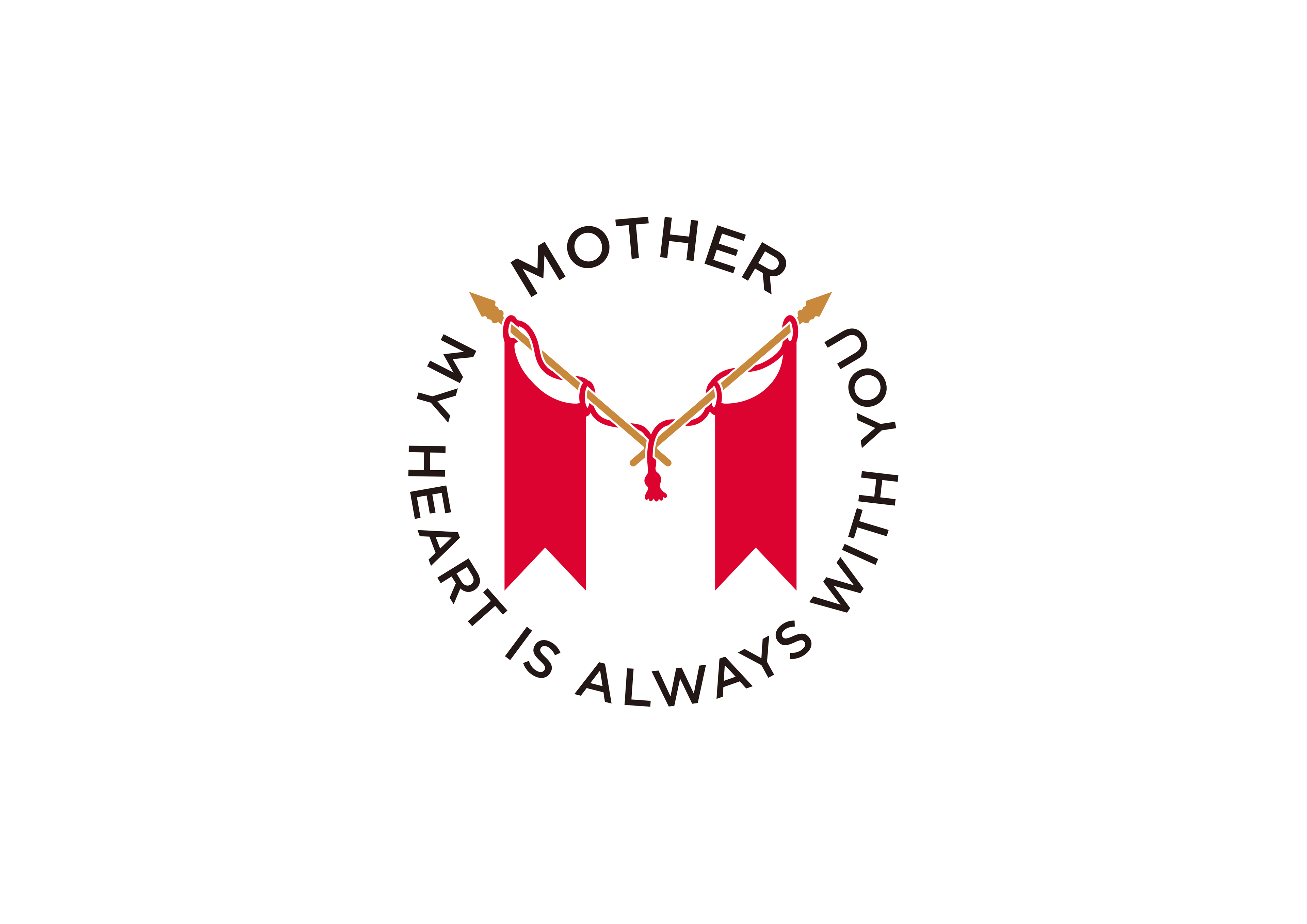
Gatheringでは東原亜希さんが代表をつとめる健康食品の製造販売を行う「Mother」のC.I.をデザインしました。
「いつも、ママのそばに」
というコンセプトに基づき、家族のために毎日頑張るママを応援するというMotherの運営方針を体現するデザインに仕上げています。
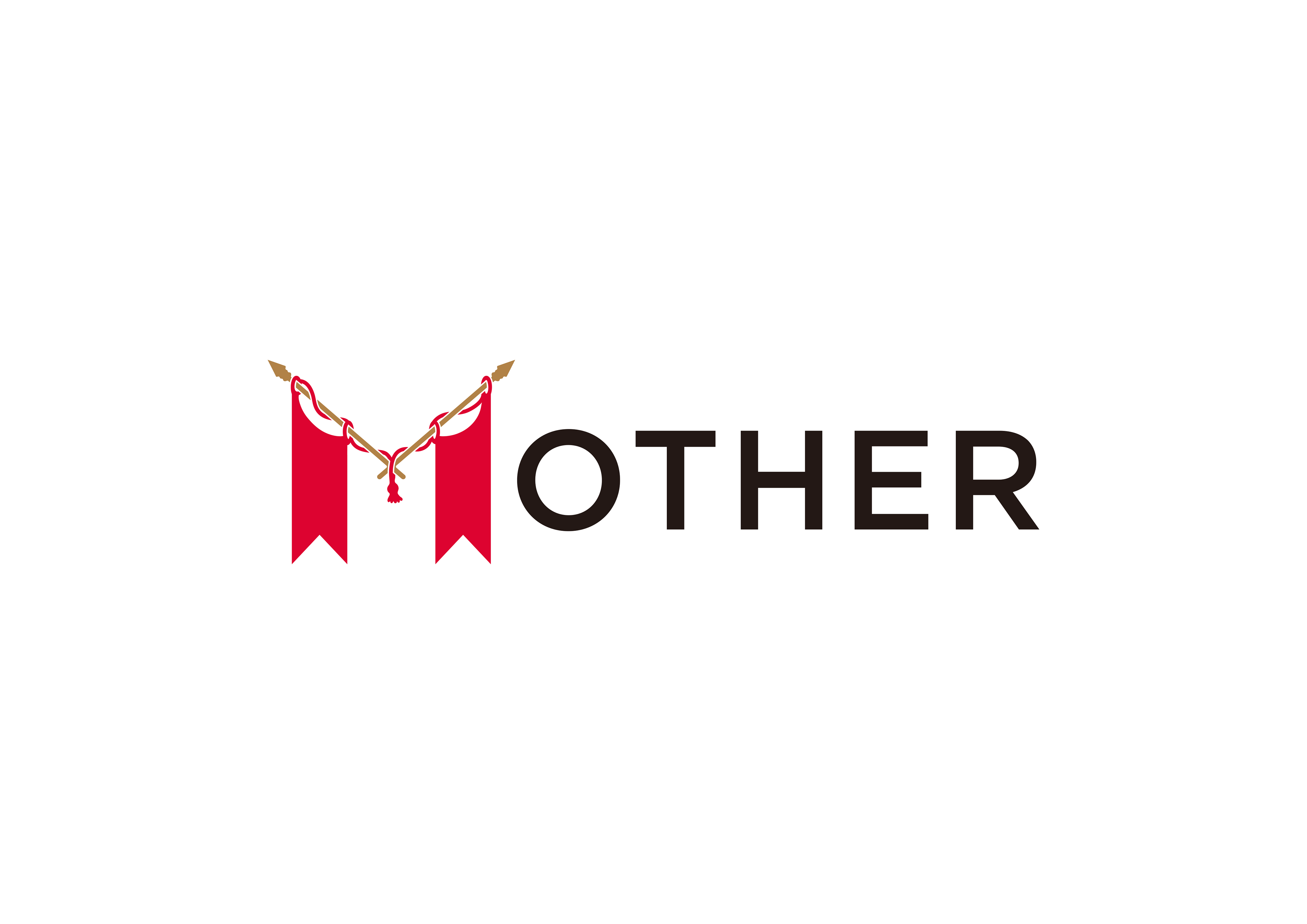
基本ロゴに加えてトレードマークと柄の組み合わせで表現するC.I.です。
This logo is the central element in Mothers’s visual communications system.
Through consistent and repetitive use as a signature device and design element in all of Mother’s visual communications, the logo becomes a visual shorthand which identifies the Agency and symbolically embodies its activities, achievements and goals.
The logo should never be altered or distorted in any way. It must not be re-drawn, but rather reproduced photographically from reproduction artwork included in this manual.

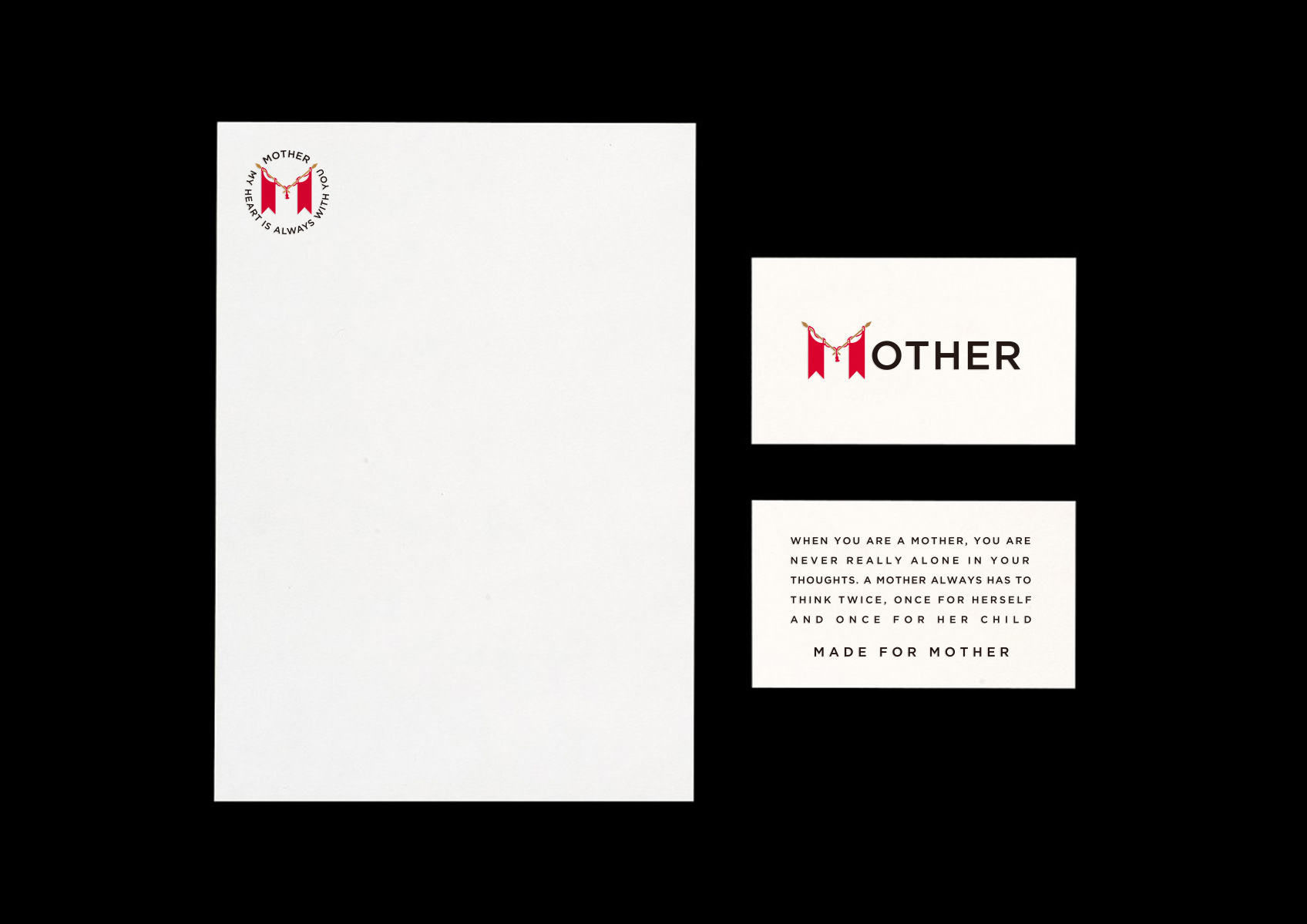
Reproduction Art
Other Symbols
This artwork should be used at the tag and labels . Reductions and enlargements will alter the character of the typography.
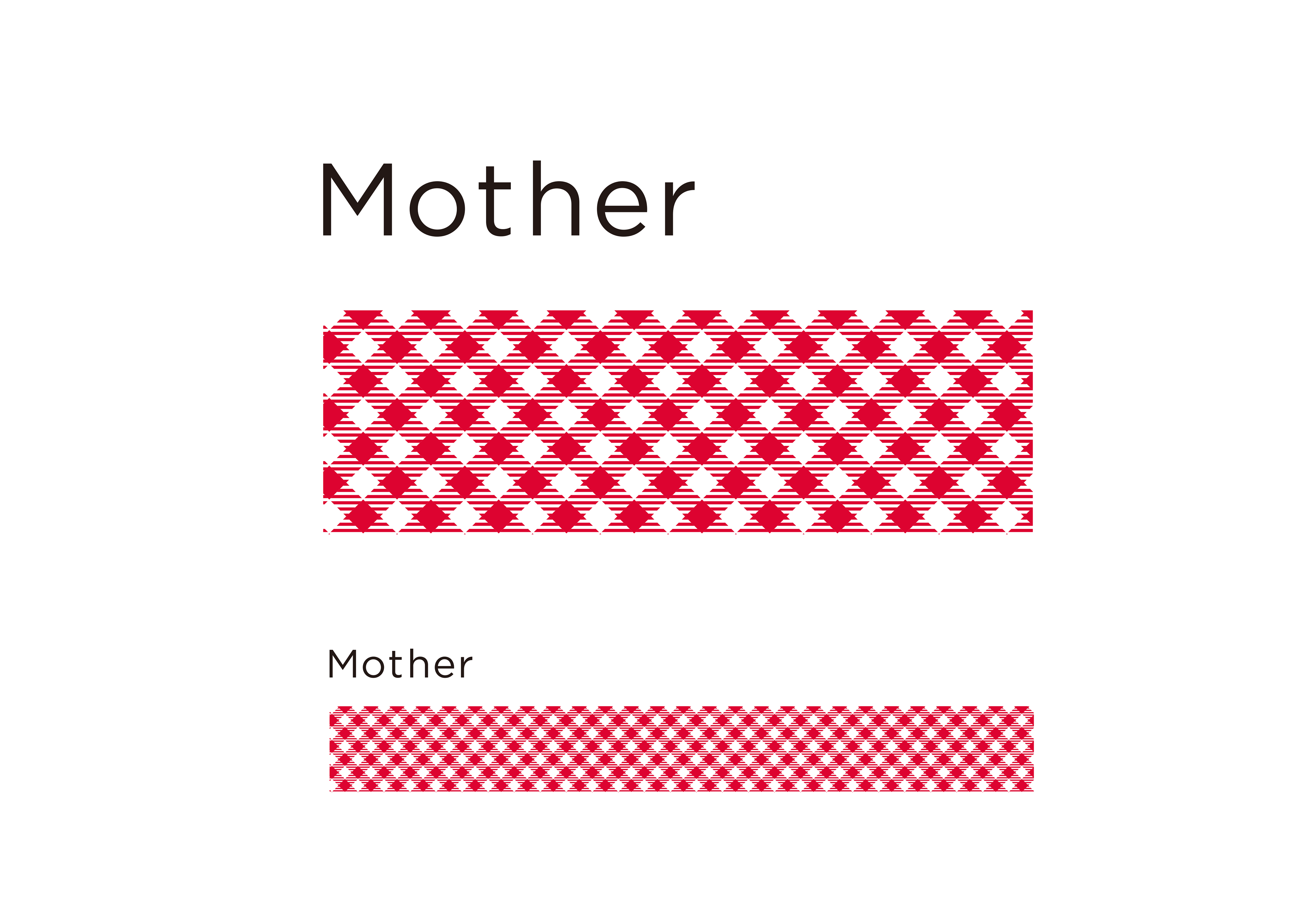
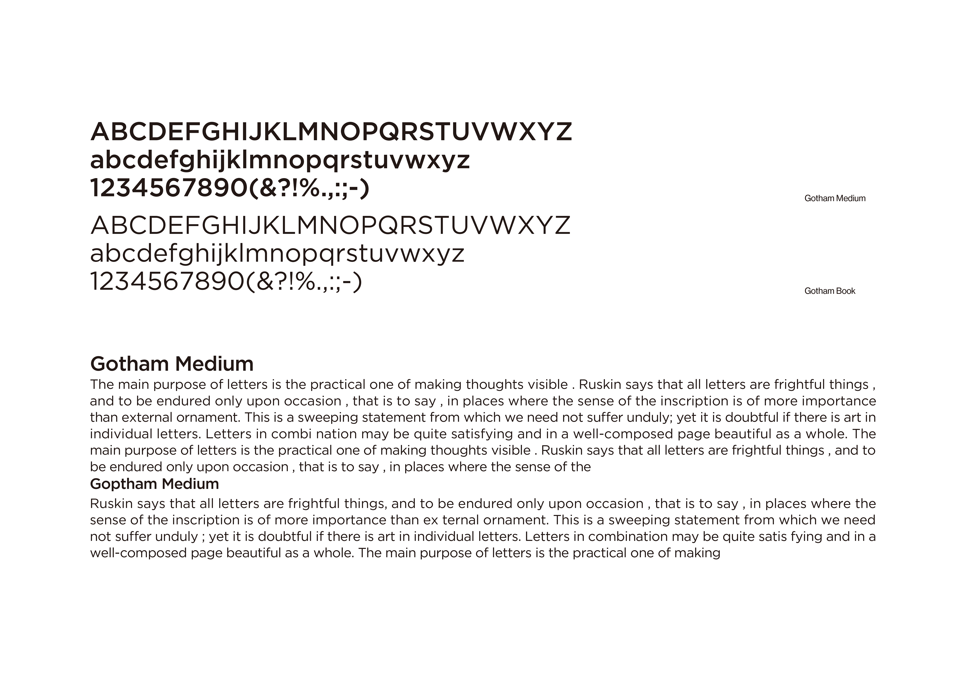
Typeface
Sans Serif Gotham
Gotham is the most important family of type in the Mother Unified Visual Communications System. Gotham Heavy is used in combination with the logotype to form the fundamental elements of identification.
In addition , this typeface can be used in numerous media and in a variety of situations to create a clean and con temporary visual program . The cursive san-serif letterforms make it extremely legible, even at very small sizes.
Headings which accompany Gotham medium text settings are set in Gotham Medium. Incertainsituations Gotham Heavy may be an appropriate alternative . Headings are set in upper and lower case.