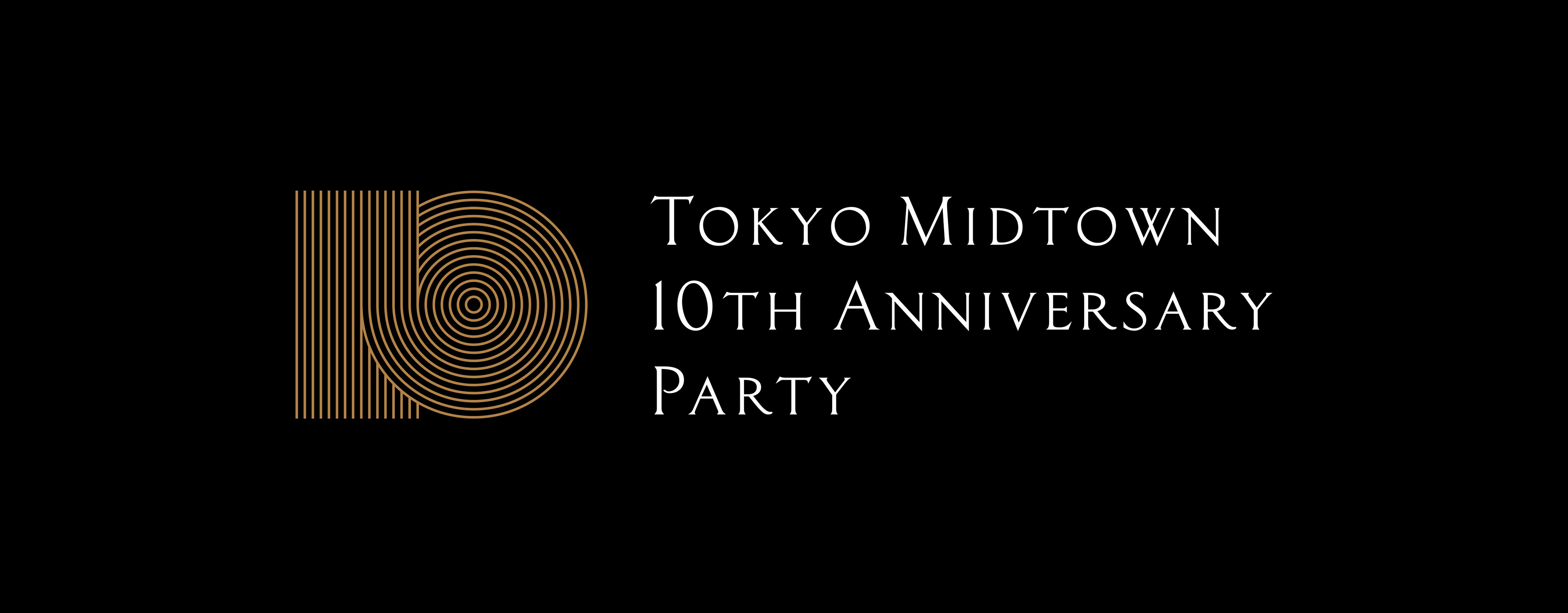
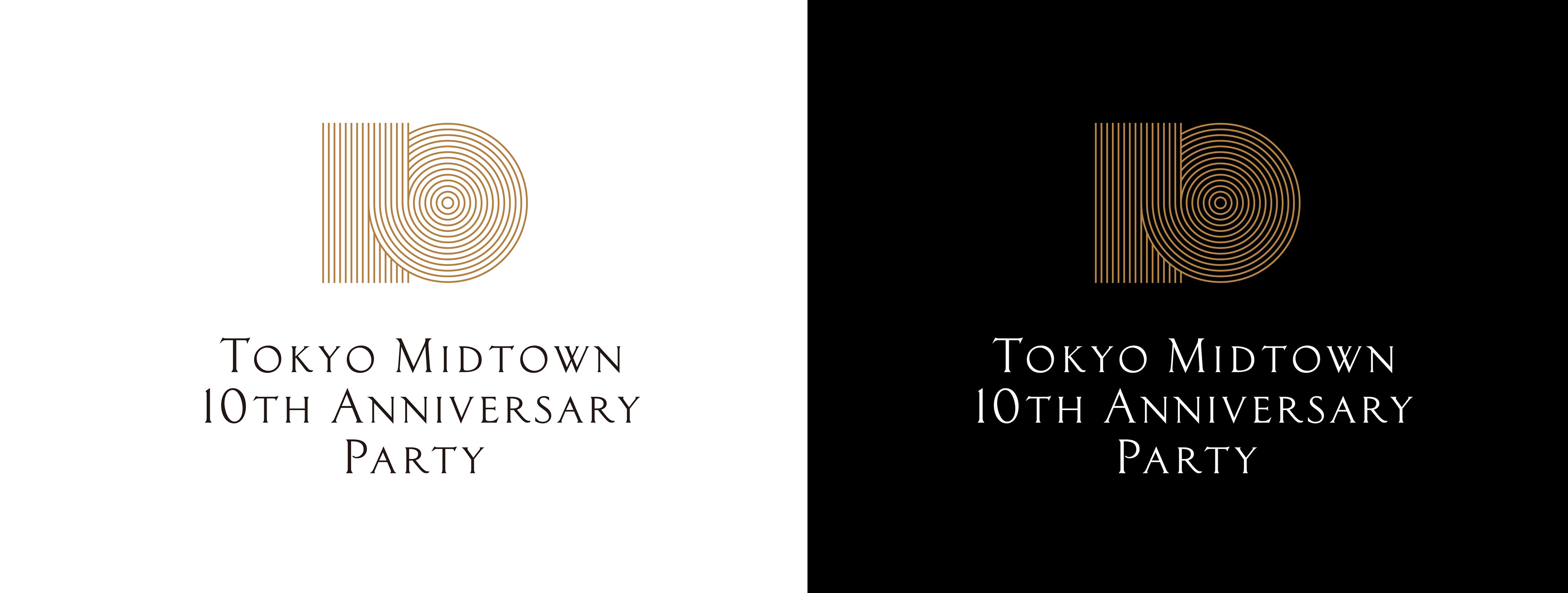
TOKYO MIDTOWN
10TH ANNIVERSARY
Gatheringでは、9周年から引き続き東京ミッドタウン10周年を記念したビジュアルアイデンティティーのデザインを担当しました。
2007年春の開業以来、東京ミッドタウンは「JAPAN VALUE」を世界に向けて発信していくことを街づくりのビジョンとしてきました。
・多様な都市機能をコラボレーションさせて新たな価値を創造する「DIVERSITY」
・日本古来のおもてなしの心が息づく「HOSPITALITY」
・デザインとアートの新たな才能をはぐくむ「CREATIVITY」
この3つのコンセプトのもとに10周年を機にあらたに加わった「JAPAN, THE BEAUTIFUL」
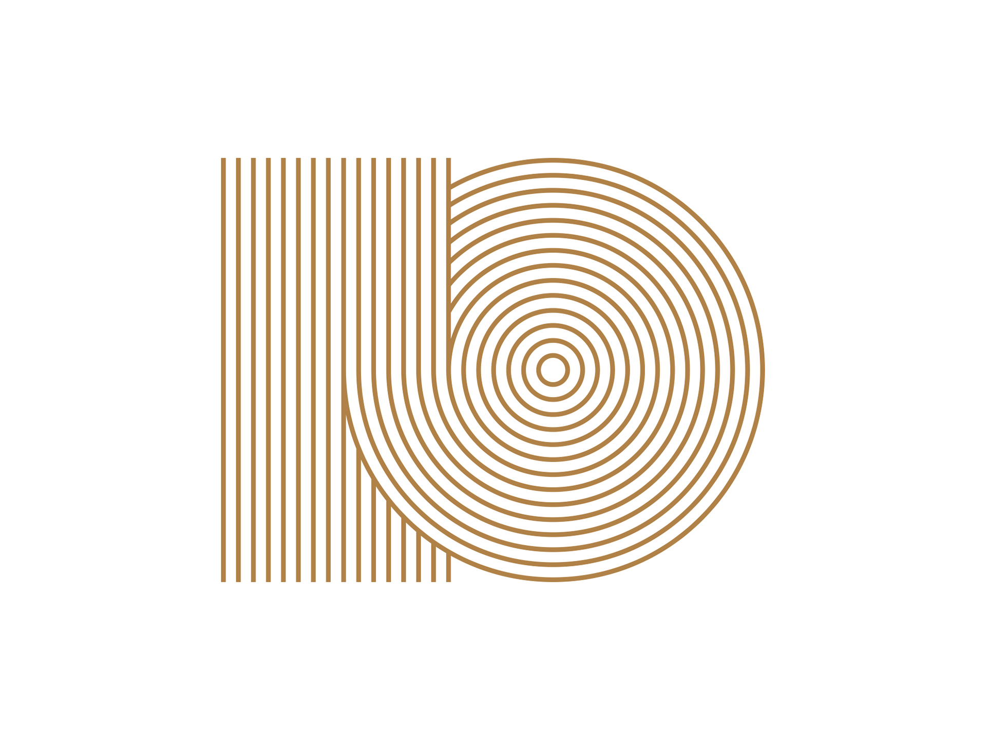
10周年の東京ミッドタウンに新たに加わった新たなビジョンである「JAPAN, THE BEAUTIFUL」を、9周年より続く水引きモチーフを踏襲してアイデンティティーをデザインしています。
Gathering designed a visual identity to commemorate the 10th anniversary of Tokyo Midtown. Since its opening in spring 2007, Tokyo Midtown has made the vision of town planning to send "JAPAN VALUE" to the world. Collaborate diverse urban functions and create new value "DIVERSITY" The heart of ancient Japanese hospitality is breathtaking "HOSPITALITY" Creating new talent for design and art "CREATIVITY" Based on these three concepts, I added a new message here on the occasion of the 10th anniversary. "JAPAN, THE BEAUTIFUL" Continuing from the previous year, expressing "JAPAN, THE BEAUTIFUL" which is a new vision newly added to the 10th anniversary of Tokyo Midtown, I am designing the identity of the 10th anniversary following the hydraulic motif lasting from 9th anniversary.

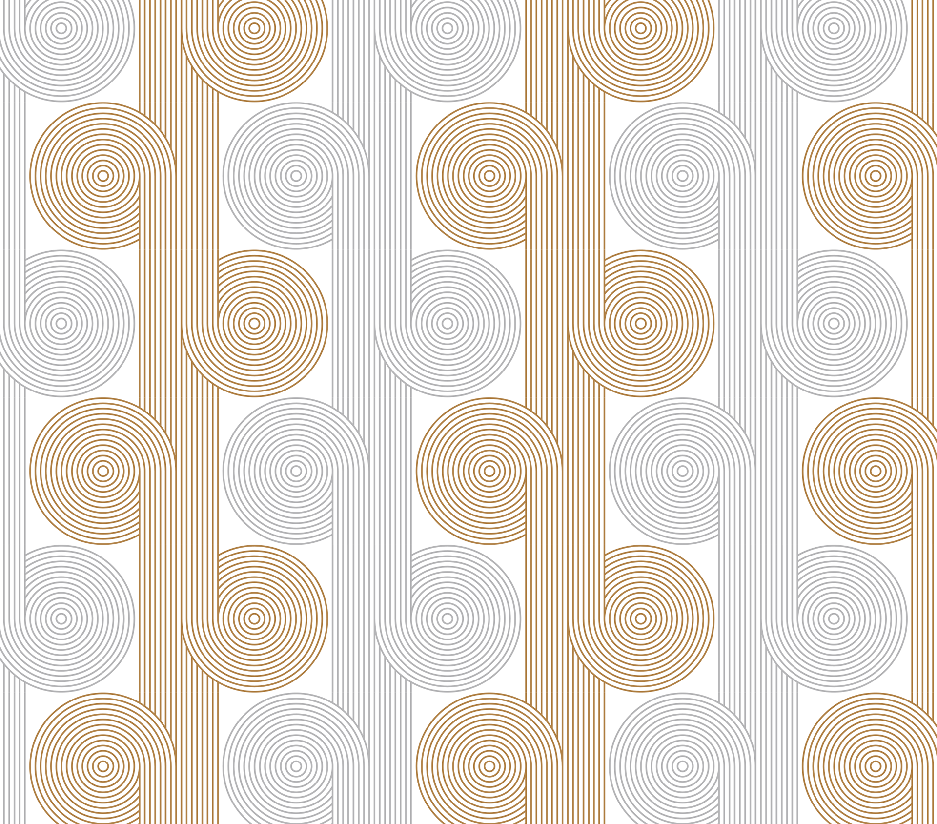
Reproduction Art
Pattern
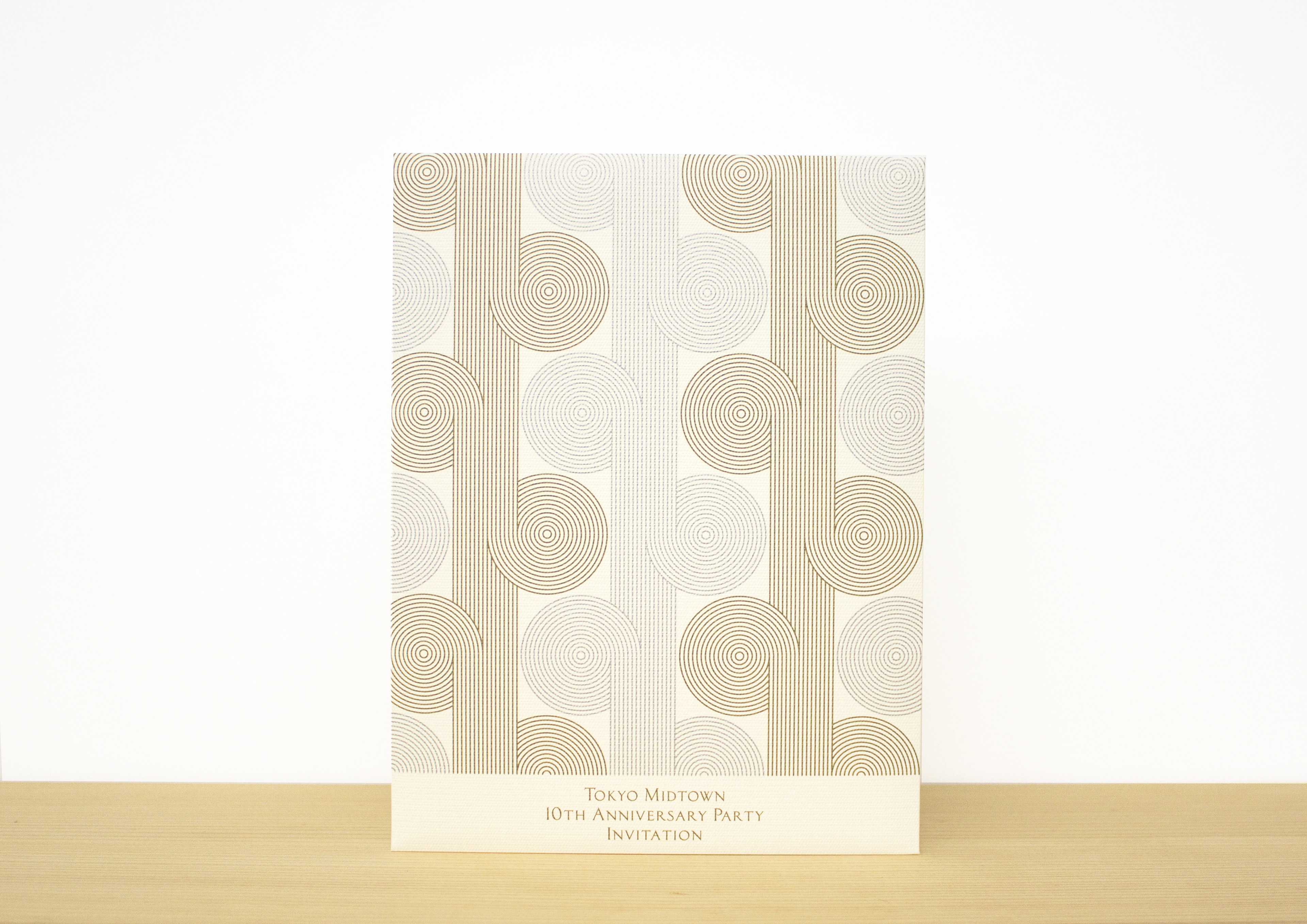
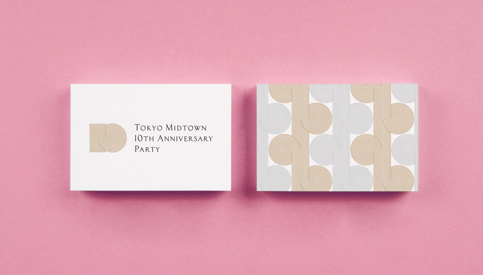
ロゴから展開されるビジュアルアイデンティティとして、館内等で使用する「柄」をデザインしています。
10周年という節目において、今後の更なる飛躍を象徴するようなイメージを持つビジュアルをデザインしたいと思い、ジャックと豆の木を彷彿させるような上へと伸びてゆく植物をイメージしてデザインしました
ロゴと展開ビジュアルに強い関連性を持たせ館内のビジュアルエレメントをなるべく「シンプルで簡潔」に仕上げることで、今回のメインコンセプトである「JAPAN, THE BEAUTIFUL」を表現しています。
We designed "Pattern" to be used in the TMD etc. as a visual identity from the logo.
In the milestone of the 10th anniversary, We'd like to design a visual that has an image that symbolizes a further leap in the future, We design the plant growing upwards. By making a strong relationship between the logo and this visual, visual elements in the hall are made as simple and concise as possible.
It was able to strongly express this main concept, JAPAN THE BEAUTIFUL
INVITATION
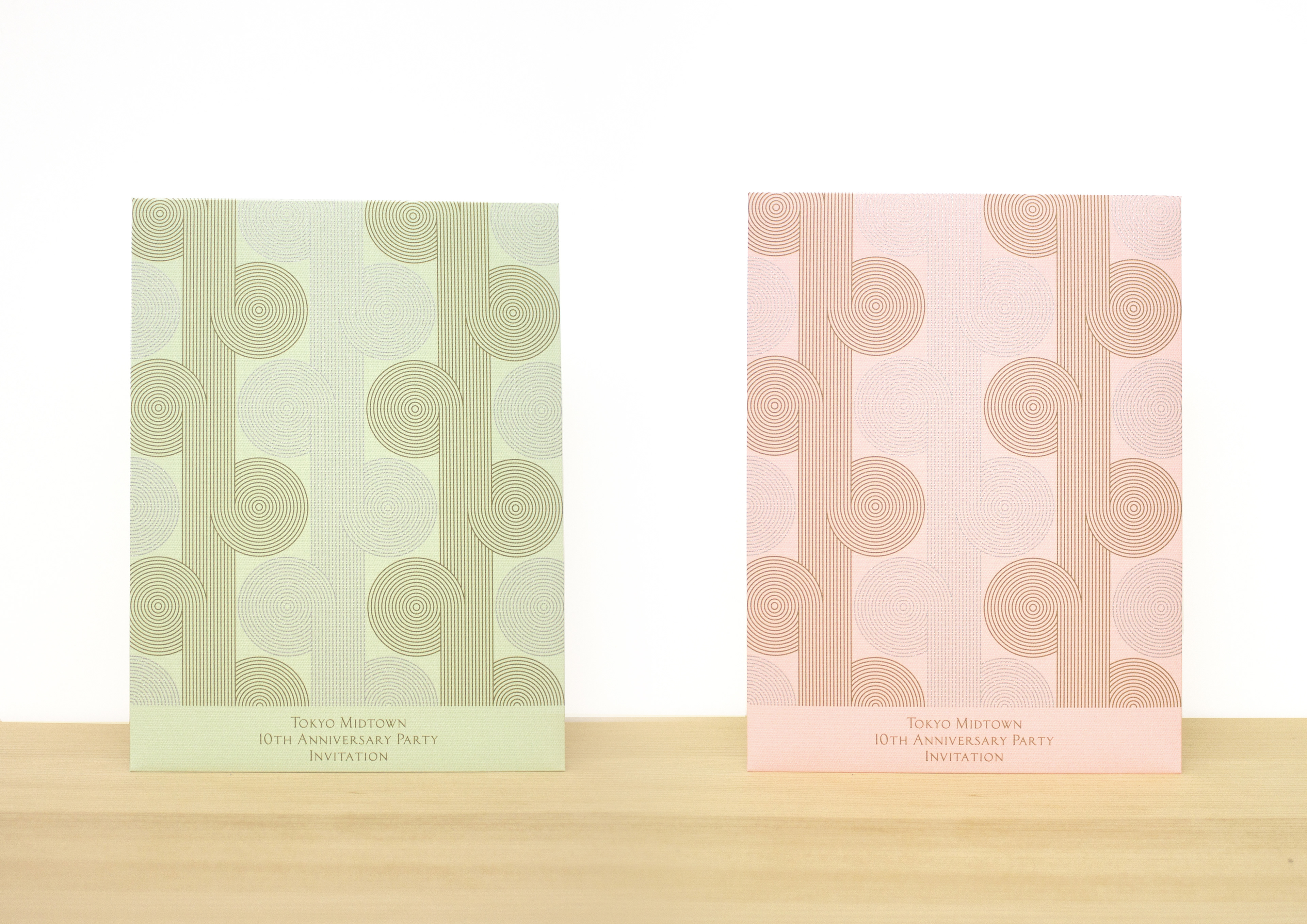
東京ミッドタウンの「おもてなし」の心の一環として、受付でのカスタマー識別を容易にすることでスムースな入場を提供できるように複数色のエンベロープを用意しました。桜の季節の開催に合わせて、古来より使われている桜に合わせた和のカラーチャートを使用して日本の美しさを感じるデザインに仕上げています。
As part of the mindset of Tokyo Midtown's "hospitality", we prepared multiple color envelopes to make it easier to identify customers at the reception and to provide smooth entry.
In conjunction with the holding of the cherry blossom season, we use Japanese color charts that match the cherry blossoms used since ancient times to create a design that feels Japanese beauty.
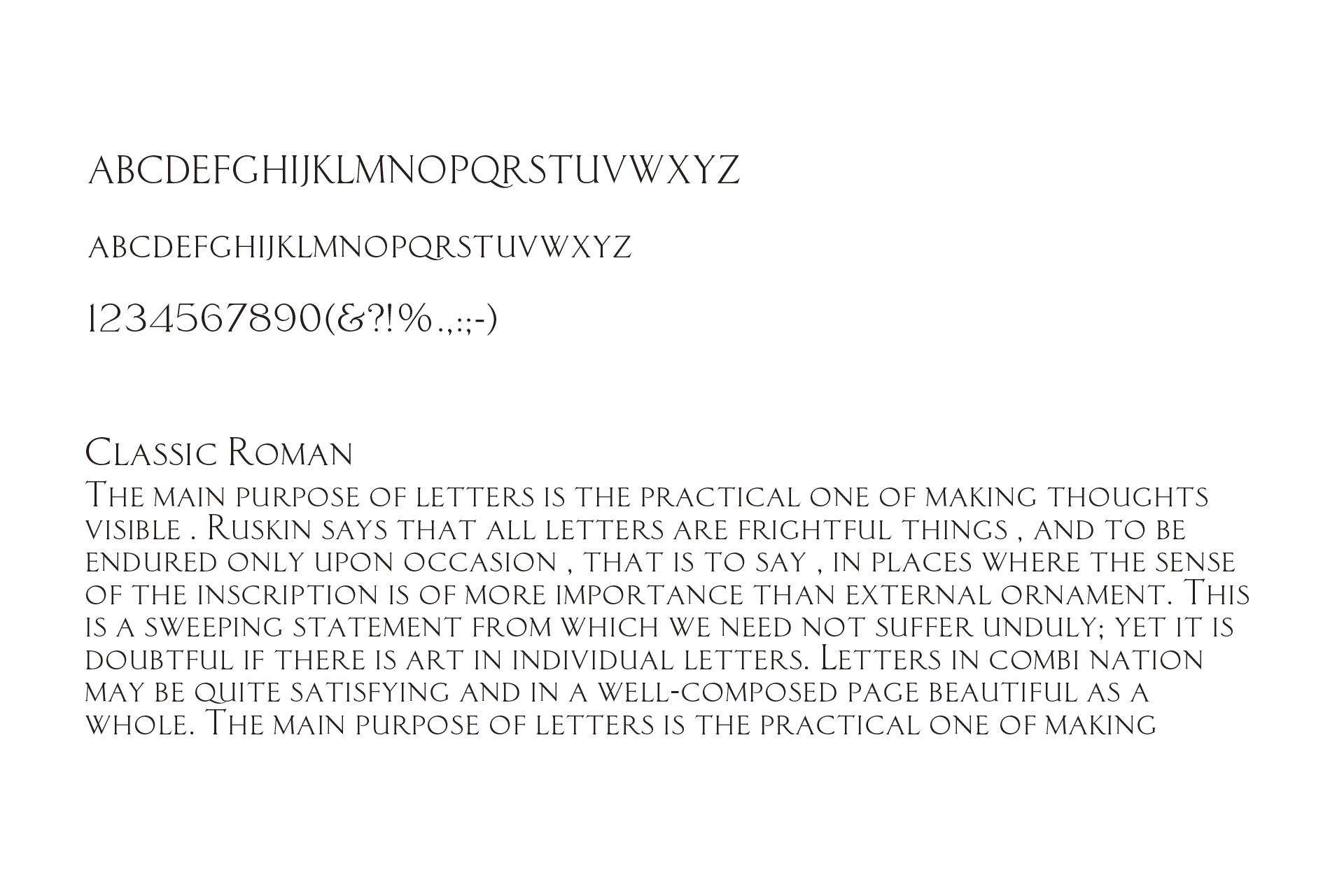
Typeface
Classic Roman is the most important family of type in the Tokyo Midtown 10th Anniversary Unified Visual Communications System.
In addition , this typeface can be used in numerous media and in a variety of situations to create a clean and con temporary visual program . The cursive san-serif letterforms make it extremely legible, even at very small sizes.
Reproduction Art
IMAGE VISUAL POSTER
アイデンティティからの展開ビジュアルとして、東京ミッドタウン10周年ロゴとの繋がりとして「線」をモチーフにした別ビジュアルイメージを織りなす線で表現しています。
円形は始まりも終わりもない「完全性」「永遠」、三角形は「成長」や「拡大」、螺旋流線形は自然の強い力と関連づけられ「エネルギー」や「生」を表しています。
10周年を記念するにふさわしい想いを込めたデザインに仕上げました。